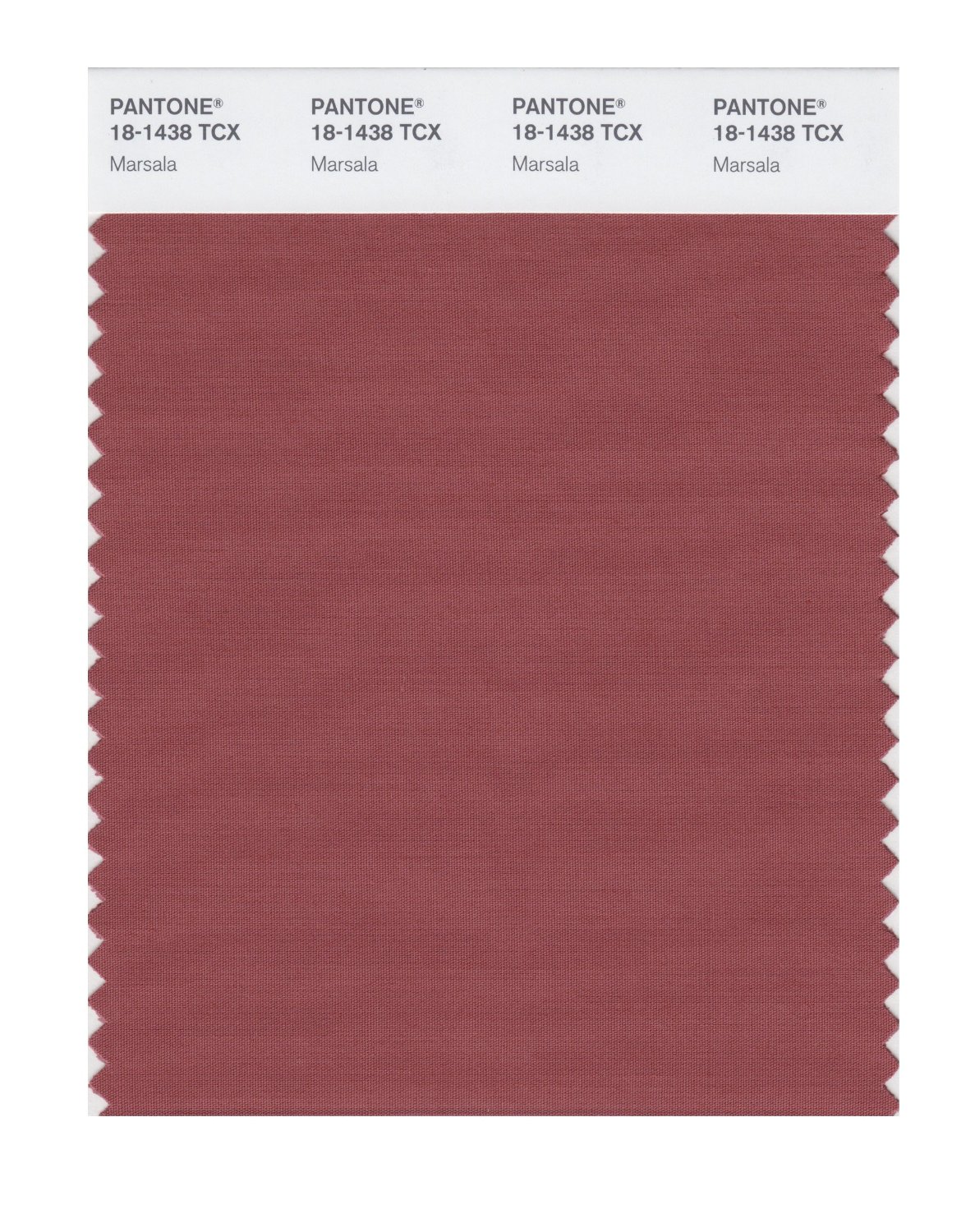
Earlier this year, Pantone announced it’s color of the year. It just so happens to be a delicious sauce for your chicken and veal. I would lick this right off my plate… but I’m still not sure how I feel about using it in my home. Meet Marsala.
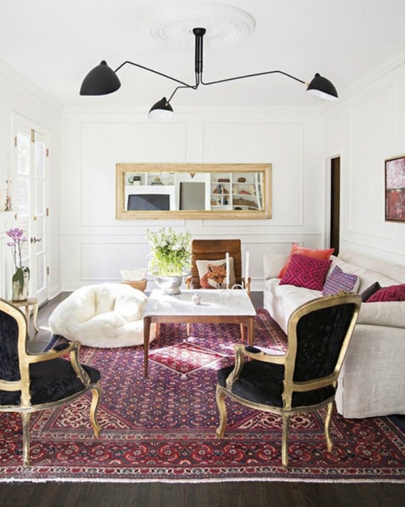
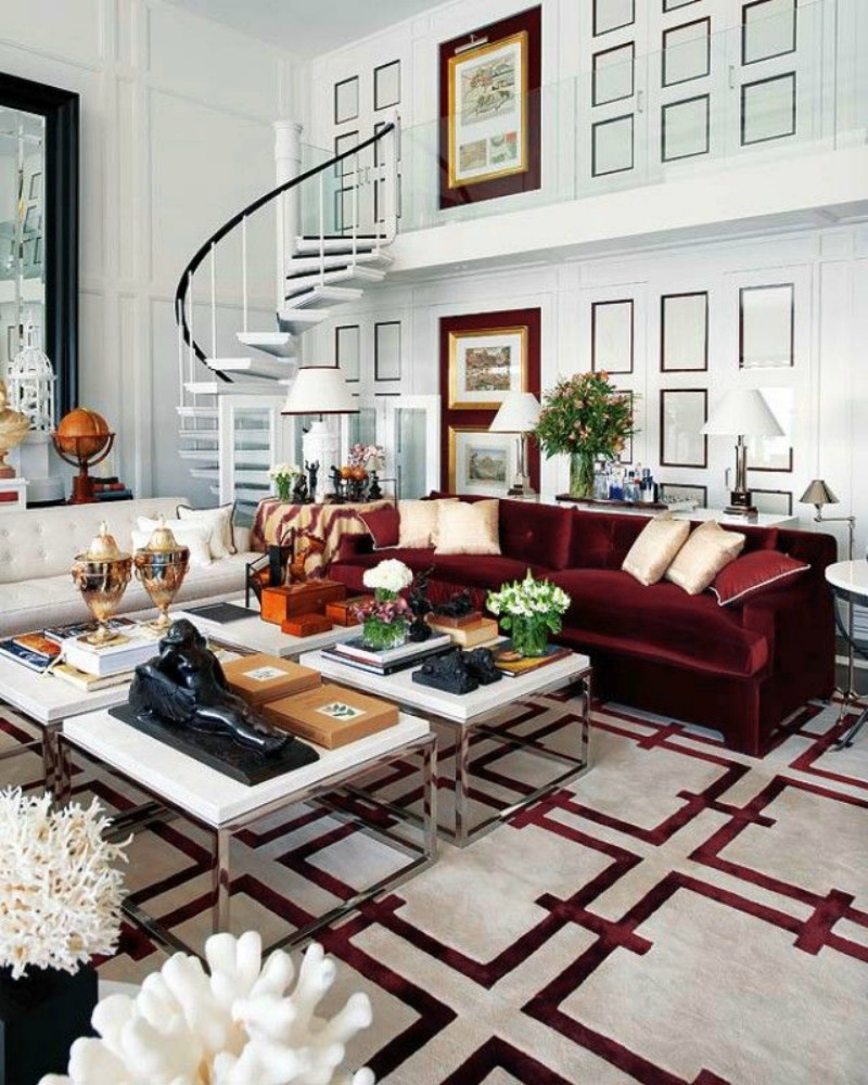
 I am relieved, however, that it’s not some other bright-hued color like the previous years…neutrals are my jam and this sauce-y shade just so happens to be a neutral. I first think about how I would wear this color. What would I pair it with? How about another neutral? Obvi. Like an ivory. But that would be playing it safe. It would also look amazing with complimentary shades of blue, like denim or even a sky blue. Maybe even paired with the palest of pinks..for a fresh take on a nursery? Ok, ok- how about we just look at some inspiration?
If you’re not convinced, then just read what Pantone had to say about the color:
Sensual and bold, delicious Marsala is a daringly inviting tone that nurtures; exuding confidence and stability while feeding the body, mind and soul. Much like the fortified wine that gives Marsala its name, this robust shade incorporates the warmth and richness of a tastefully fulfilling meal, while its grounding red-brown roots point to a sophisticated, natural earthiness.
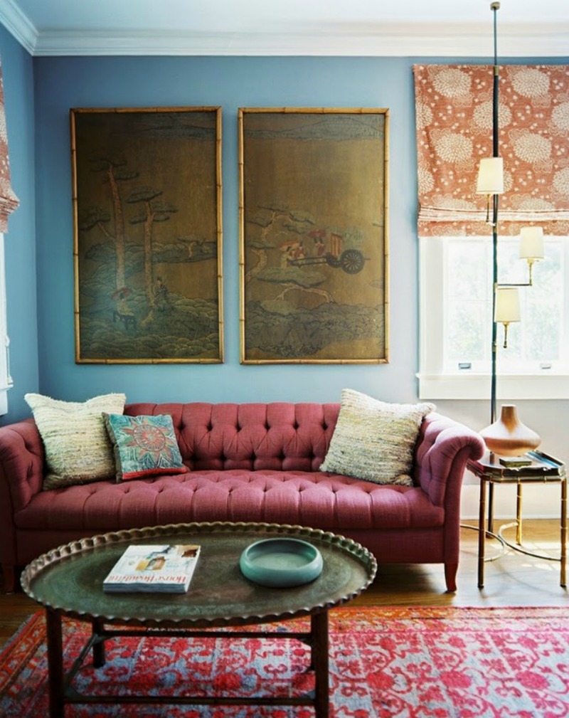
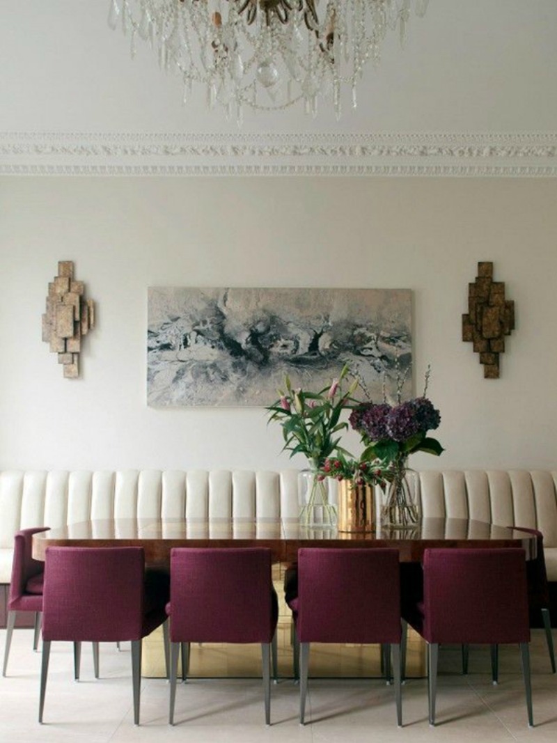
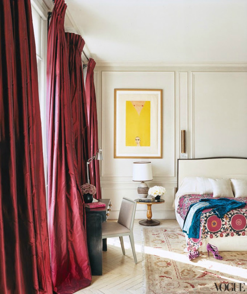
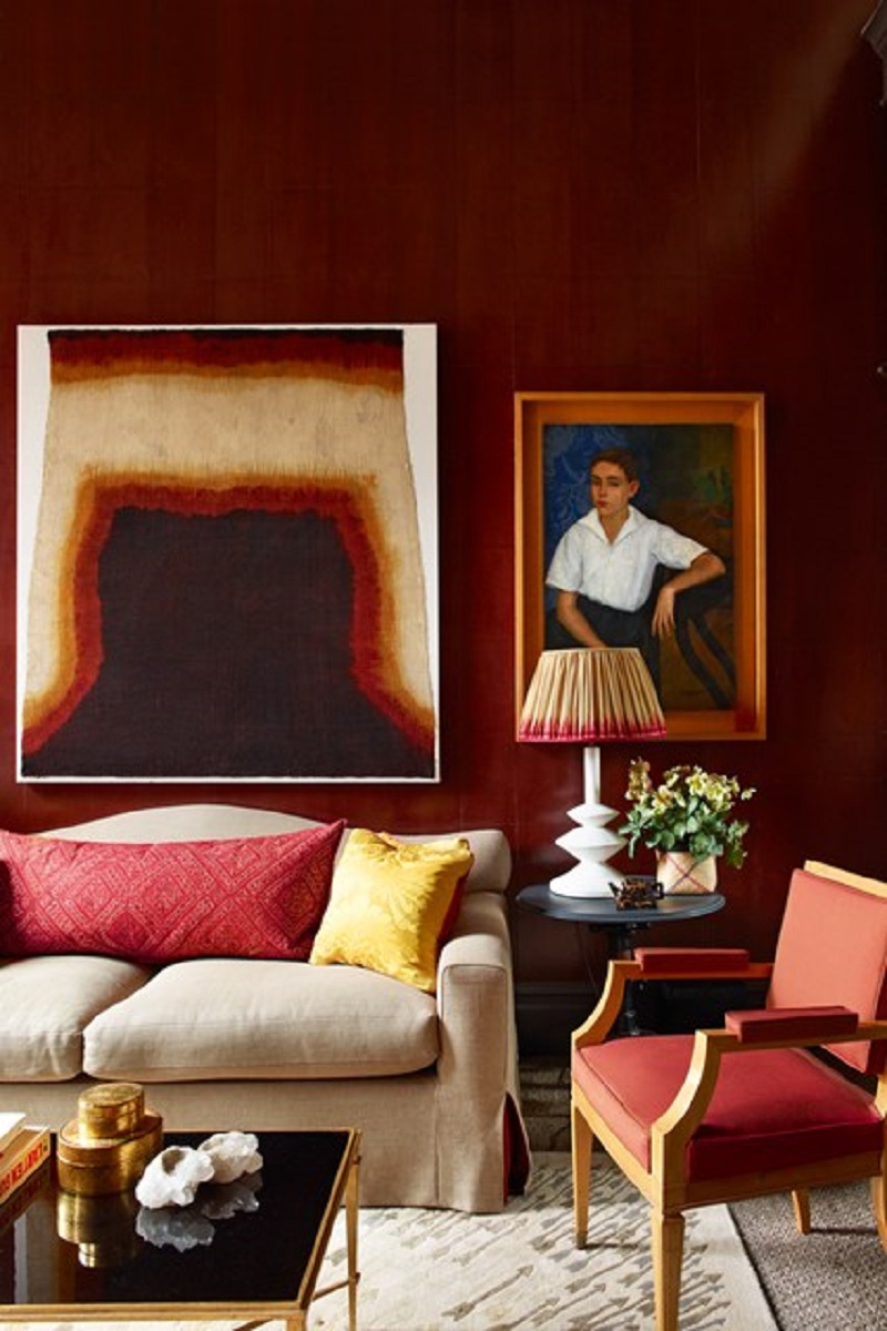
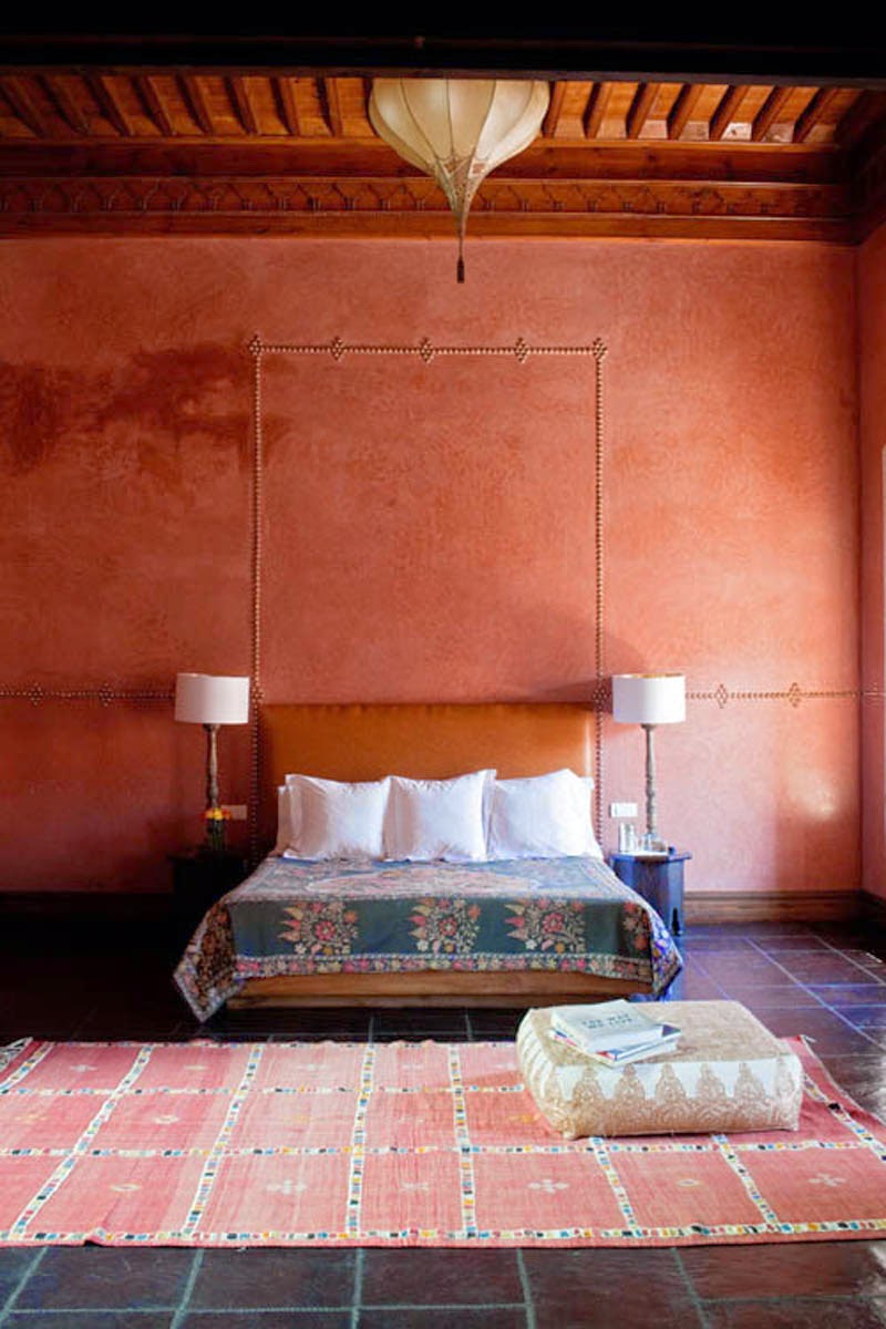
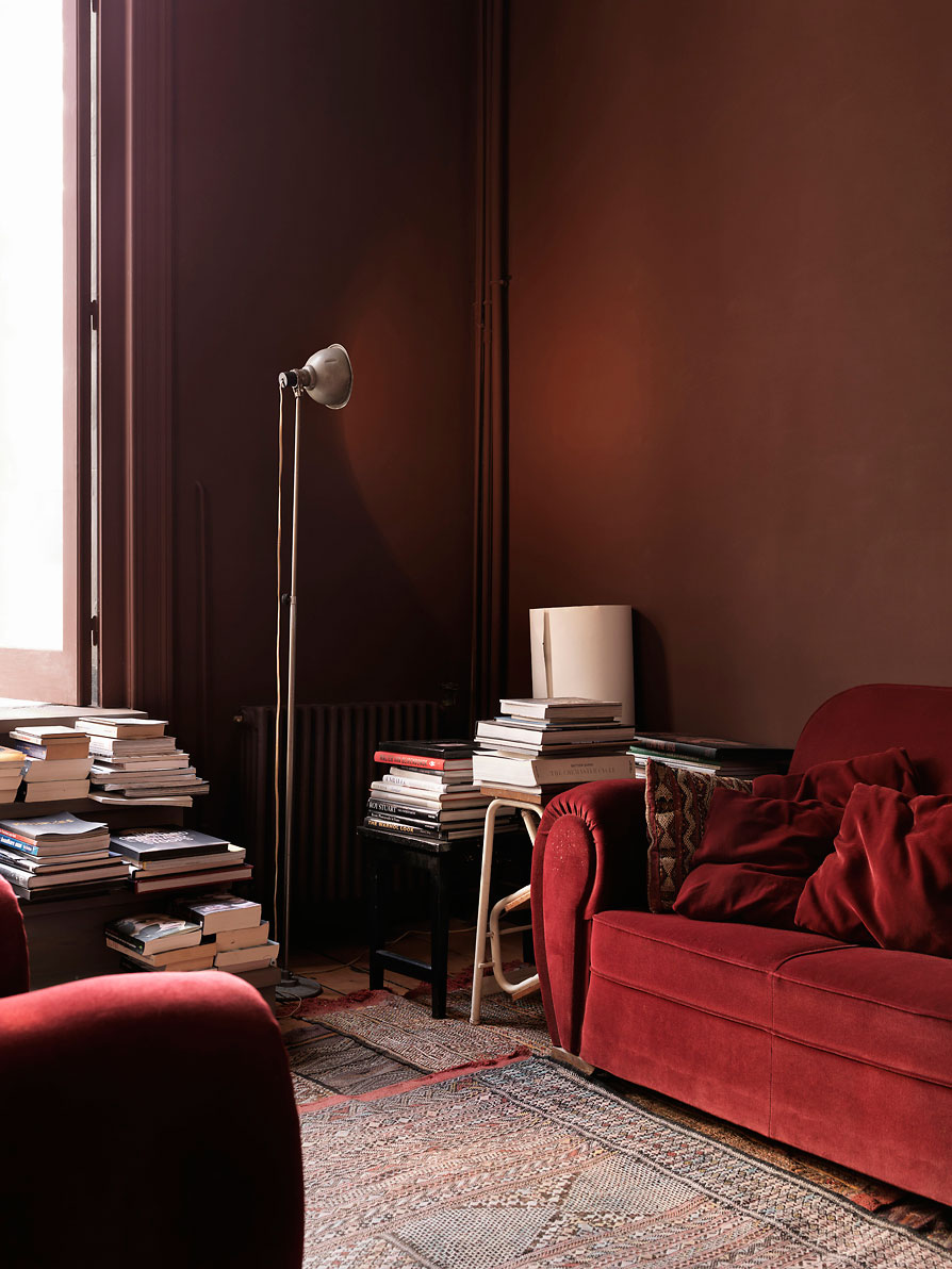
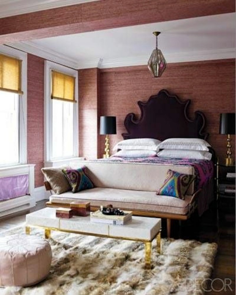
Sexy, right? From the slightest hint of color in silk curtains or grounding an entire room with a marsala-toned rug, I’m surprisingly loving this color! Are you running to the hardware store to buy a can of paint as we speak or do you prefer to keep this color on your plate? Would love to know!
